The Delicate Art of Zoning an Interior
The fashion of knocking through and extending our houses has meant that the way our homes are configured is radically different from the way they used to be. This has seen the death of the dining room, the waning use of the living room and the birth of the mega kitchen. But these large spaces aren’t always what they are cracked up to be. Yes, they are impressive but, ironically, they just aren’t conducive to building a comfortable environment. Big spaces can leave us feeling exposed, vulnerable and plain old uncomfortable. Though the rooms have changed, the functions they are used for haven’t. We still like to sit comfortably and watch TV; we host large dinner parties and make a big mess while preparing food.
I’m not saying we need to start putting all those walls back up because even though we can feel intimidated by large spaces we sure hate poky ones. The answer is to create intimate zones in large spaces. This doesn’t involve rebuilding walls but in using artful tools to zone spaces by function and create them as individual areas. But how on earth do you do that? Well, as I am the queen of zoning I have learnt a few tricks to zone a space to make it both beautiful and comfortable.
Give each function its own space
To start the process of zoning you have to know what your lifestyle is and what has to happen in each space. It’s easy to think of this in kitchen spaces because we are now cramming so much into this one room. From offices to eating, maybe even some cooking, it’s all happening here. However, these aren’t the only rooms doing a multi-functional job. Guest rooms double up as offices, lounges as music practice rooms, bedrooms as….. no, wait! Your bedroom should never double up as anything, it should always be a relaxing sanctuary. Successful zoning starts by giving each “task” its own amount of space and keeping it to that space only. If you have an office area in the guest room have it allocated to one wall, not have bits of the office all over the place. By concentrating the zone in one area, it means you will only be in this one space when working.
Shrink to fit
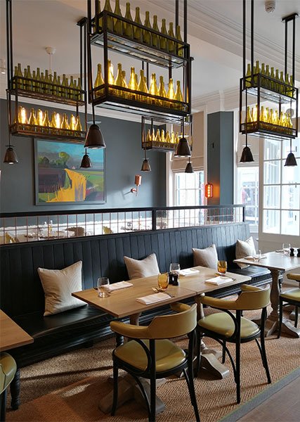
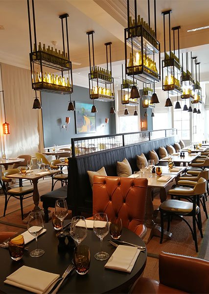
In Ingrid Fetell Lee’s book “Joyful” (Check out her amazing Ted Talk) she talks about the perfect balance of cramped vs spacious to create a feeling of connection. Though no one likes to feel squished together, personal space people, we humans are looking for a feeling of connectedness to each other. It’s that feeling of just the right amount of physical closeness that gives a party a buzz. Restaurants often use this principle when designing, often noting that diners will flock to the outer edges and the booths over sitting in the exposed centre of the room. The Swan in Southwold tackled this by introducing a semi partition down the centre of the room. Ironically diners are sat far closer together than they would be at separate tables but that now creates the feeling of a fun-filled space. Incidentally, it also allows the restaurant to fit more covers in and hence make more money. A win all round.
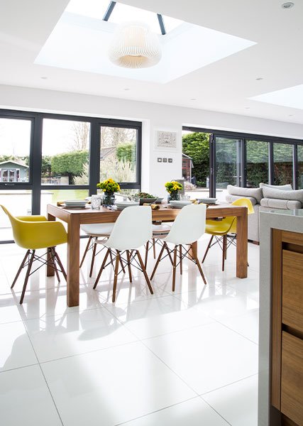
The semi partition can work really well in a kitchen, creating a physical divide between the cooking and eating areas. No more entertaining while surrounded by the dirty pans. However by keeping the partition low you also have the idea that the room is light and airy.
Some rooms are really large and have two functions to fill. This playroom needed a play end and also a snuggle TV end. A semi partition would have sliced it up too much, but by designing this metal structure with Perspex discs it physically divided the space without losing the connection between the kids watching TV and those doing arts and crafts.
Lighting
Lighting acts really well as the invisible wall. This works in two ways.
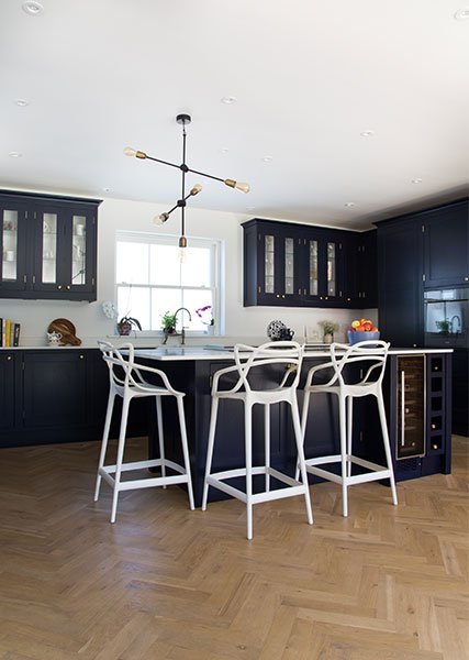
The first is that you can create multiple lighting circuits, therefore lighting each zone individually. The simplest form of this idea is bedside lights. Why light an entire room if you just want to read before you go to sleep? When I design kitchens, the lighting plan can get pretty crazy in here, but I will always start by putting the cooking, eating and seating areas on different lighting circuits. This way you can switch down the spaces you are relaxing in, creating a comfy little island amid the bigger room.
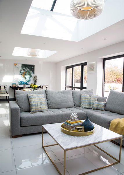
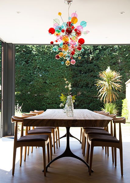
The second way lighting works is by using pendants to create a focus on a certain space. Classically this is over islands or dining room tables. But pendants are also great in living rooms over coffee tables. Quite often I’m finding we are creating a smaller seating area in living rooms with a secondary seating section at one end. Pendant lights over the coffee table allow the focus to come to the main section and the other parts of the room to drift away.
Take a Mental walk
My final step when zoning is to work it all out on paper then mentally walk my way around the space. Think how it would be to sit on the sofa. Ask if you will feel “protected” and relaxed in that space. Double check you have a sight line to the TV. If the answer is yes, you have successfully zoned your space. If the answer is no, check if there is a better way of doing it. It’s like solving a Rubic’s cube; it takes a bit of thought and patience but you can figure it out!


