A Victorian house extension of dreams
Victorian Family Home | Extension and Renovation | Sevenoaks, Kent
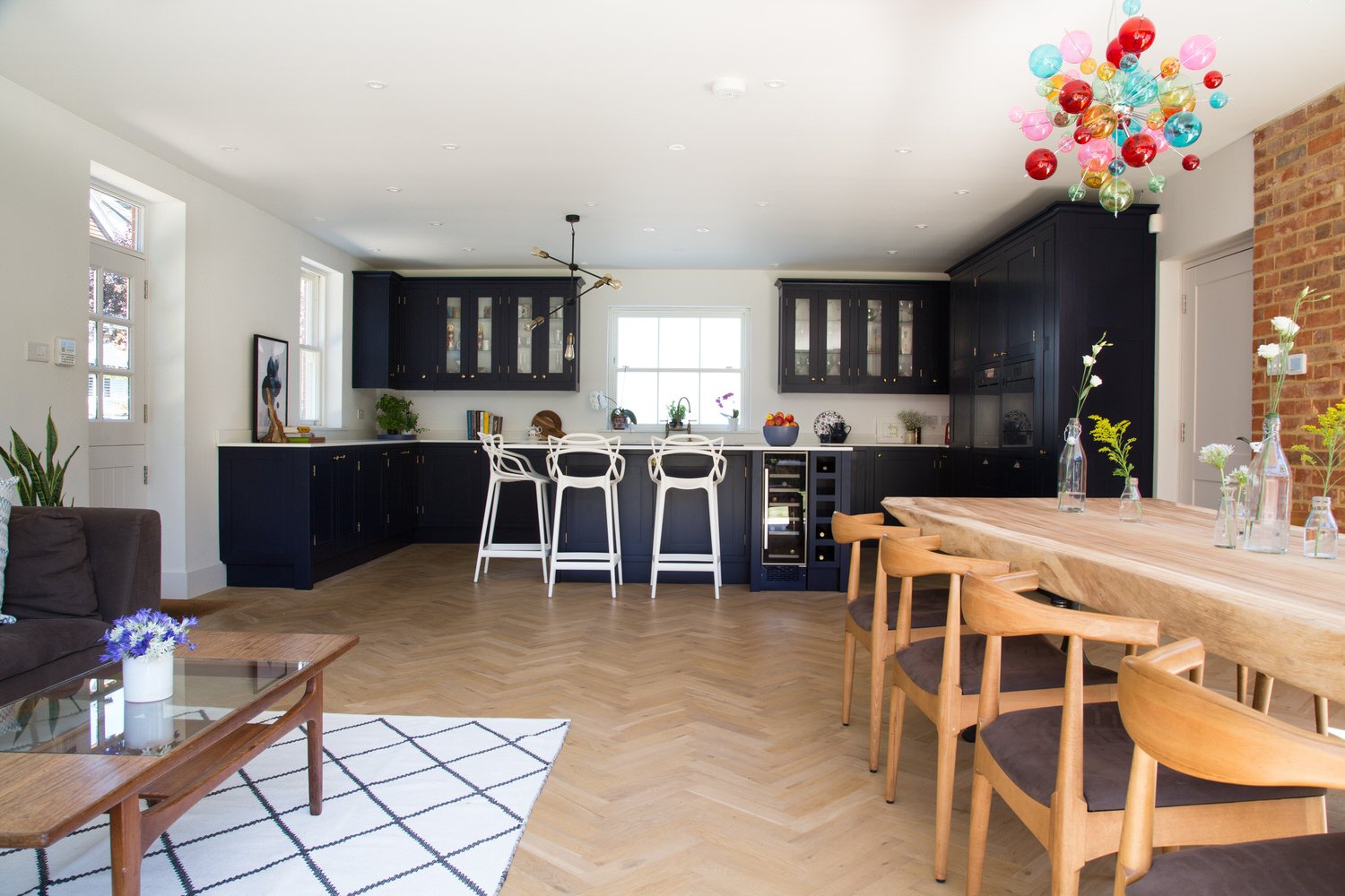
I was very excited to be brought onto this Victorian house extension project. The space added to this period property provided the perfect blank canvas to work with. We wanted to design a room that worked with the clients’ busy family lives as well as complementing the existing decor in the rest of the house. It needed a wow factor as people stepped through the door, but also had to be practical.
Zoning the Space
To make the most of this large kitchen space, we divided the room into three separate areas, using lighting and distinct accent colours to give them an individual feel. We loved the exposed brick wall next to the bi-folding doors – it breaks up the space and gives a sense of the outside inside.
Creating a Hub
The kitchen is very much the hub of this house. The clients love entertaining friends and family, so to me it was important to create a kitchen where people can sit and chat while food is being prepared. Alternatively, when it’s just the immediate family, they can sit together in a more intimate setting.
Going Bold
With this much space, we went for an impact dark colour on the kitchen cabinets with a white reflective composite work surface which helps bounce the light, to keep it bright and fresh looking.
Entertaining
As well as creating an attractive feature that softens the tone of the room, these two informal seats are a popular place for a quick catch up meeting or a quiet phone call when the boardroom is not in use.
The Power of Lighting
These bubble lights add a pop of colour. Lighting is really important in this design for creating intimate zones in a large space. So when the clients have finished the cooking, they can turn down the kitchen lights and move into the dining area to enjoy their meal. When you’re entertaining you don’t want to feel like you’re still in the kitchen, you want to be relaxing with your guests.
Keeping it Calm
We kept the colours neutral in the sitting area, with accents of calming blue. This is a space for catching up with friends or just unwinding, curled up with a book and a cup of tea. An added zing of yellow helps tie this area in with the dining room lights, giving a feeling of flow between different spaces.
A Retreat
In this master bedroom we wanted a real feel of luxury. This was to be a grown-up space. It had to be inviting, soothing, somewhere our clients would be able to close the door and have the best night’s sleep possible.
Star of the Room
We picked this stunning wallpaper to counteract the skeiling while giving the illusion of extending the bedhead, making the bed the star of the room – as it should be! The metallic element in the wallpaper reflects more light into the room. We added pink accents to give a lift and warmth to the grey, lending a freshness to the space.
Bring it all Together
Good design is about getting different elements working together to build a space with interest, personality and depth. Done well, textures, space and colours all balance each other. I really think we managed to achieve this here and the clients have some great new spaces in their beautiful family home to enjoy.
Get in touch
Request our online services and price guide.


