Making a tricky space work harder & flow better
Barn Conversion | Remodel Kitchen and Living Space | Hurst Green, East Sussex
The configuration of this long, narrow space in a beautiful barn conversion in Etchingham, East Sussex, wasn’t working effectively for the owner. Having been turned down for planning permission for an extension, my client was looking for a way to make better use of the available space.
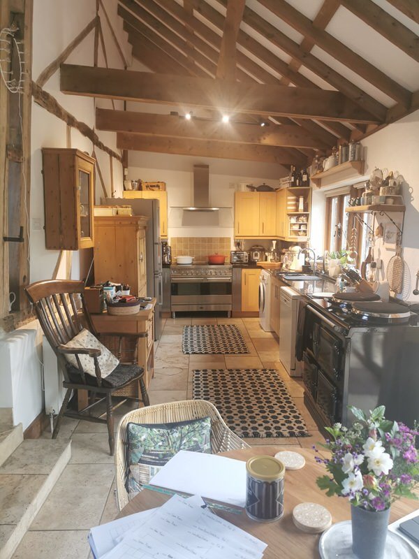
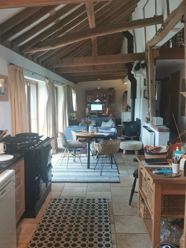
When we took on the project, the kitchen and breakfast area were positioned at one end of the room, there was a living space in the middle, and a dining area at the other end, where the table was doubling up as a workspace.
Our approach was to reconfigure the flow from one end to the other with clear zones and some flexibility. Leaving the existing kitchen in place, we moved the dining area into a more functional position next to the kitchen, adding a small table that could be extended to accommodate six people for entertaining. Next came the seating area, and finally, in the space where the dining area had been, we were able to add a new dedicated workspace.
Choosing the right furniture and furnishings
In a space like this which has length, height and not a lot of width, it’s important to choose furniture and soft furnishings that will help zone the spaces, while at the same time create flow between them and draw the eye where you want it to go.
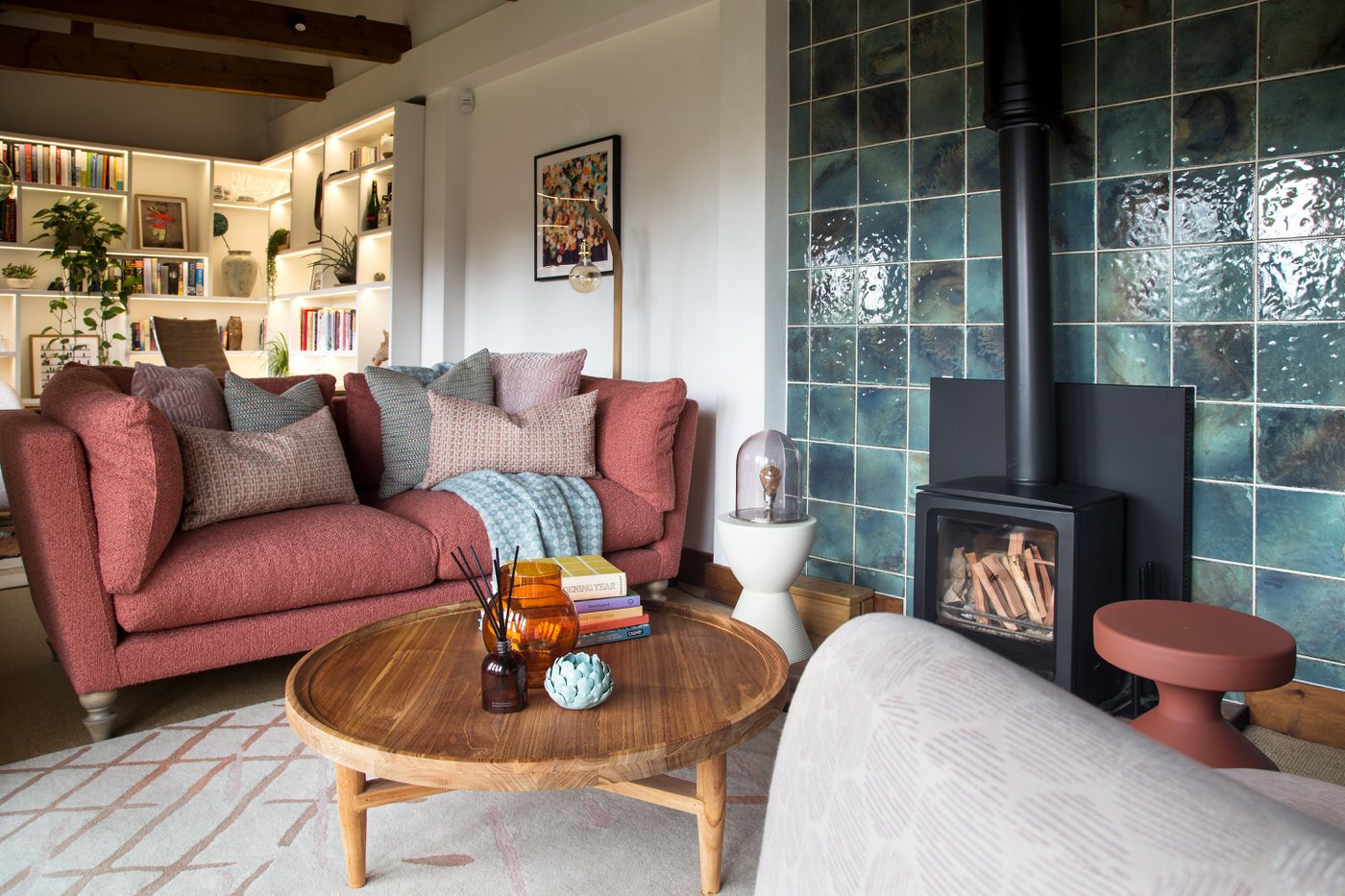
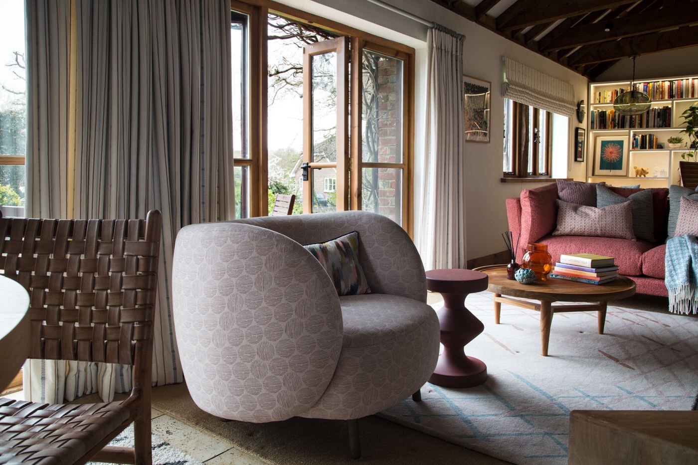
Too much small furniture can make an open-plan space feel cluttered, so we simplified with fewer, carefully chosen pieces. Lines are soft, round and curved, which not only look cosy and inviting, but are also easier to move past in higher traffic areas. We went for a smaller sofa so it didn’t dominate the room but balanced it with a generous, comfy tub chair in front of the fire.
Curtains are large scale, but light in colour to blend into the walls, showcase the architecture and highlight the beautiful view of the garden. The tiled wall behind the log burner anchors, defines and grounds the living room space.
A soft, subtle colour palette
Using colour doesn’t have to mean brights. Taking cues from the building we developed an autumnal palette with softness and texture. Terracotta, pink and tealy green add warmth, along with natural materials like wood, leather and wicker.
A custom pendant by Tom Raffield in curvaceous oak hangs over the table. Warm white walls add freshness and light. To avoid the high ceilings feeling cavernous or exposed, we used heavier colours lower down. A cream sofa would have sent the eye constantly up to the beams, instead the terracotta reflects them and grounds the scheme.
“Phoebe exceeded all my expectations. I have never worked with an interior designer so had no preconceptions, but I was very impressed with Phoebe’s ability to balance creativity and practicality.
I loved the whole process, from delving into lifestyle and needs, through mood boards and ideas and then seeing it come to life. The meetings with Phoebe were always enjoyable and fun. My space is tricky and I was asking for a lot. But Phoebe absolutely understood and delivered.”
A place to do your best work
The most dramatic change in the space has to be the addition of this enviable, purpose-built workspace, which has transformed the way our client works from home. It also means no more piles of papers on the dining room table!
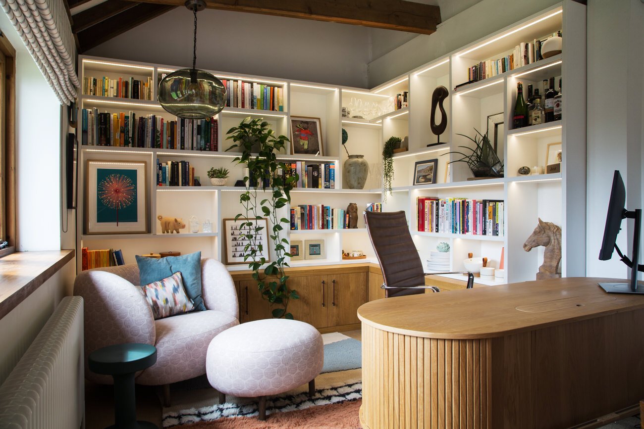
The desk doubles as a zone divider, which meant it had to look as good from the back as from the front. Again, we added a rounded end to make it easy to slip in and out to take a call, without the risk of bumping off sharp corners.
Following the line of the beams we filled the walls with full height bookcases, which opens up the space. We varied the shape and size of the shelves to create nooks that break up the rows of books and display precious items. The wooden cupboards below ground the space and provide plenty of useful storage, and their leather handles add a warm, textural detail.
The doughy chair in a custom Claire Gaudion fabric feels luxurious, and makes a cosy nest for reading paperwork. It can also be moved to the living area when entertaining.
Our client was thrilled with their new workspace. And the bookcases look so good on Zoom that colleagues have even asked if they are a fake backdrop!
MEZZANINE LIVING ROOM
This upper level space was rarely used, so we refreshed the décor to bring it in line with downstairs and create an inviting room. It can be hard to get cosy with very high ceilings, so we used warm colours and plenty of soft cushions and textures.
With the space downstairs working so hard during the day, our client now has a delightful evening retreat, a sanctuary away from the busy day-to-day part of the house.
We used a favourite painting to inform the colour scheme, pulling out warm terracotta and light blue to reupholster existing sofas and custom finish a new chair. The colours were repeated in an oversized rug which anchors the space under the high ceiling. New curtains were kept neutral to blend with the wall.
Lighting in a space with high pitched ceilings can be tricky. We solved this problem by using wall mounted lamps and tall floor lamps to create functional, inviting lighting.
“Phoebe came up with ideas that I would never have thought of and I quickly learned that I could trust her. The execution (something I was concerned about) went very smoothly due to Phoebe’s experience, planning skills and contacts.
The finished results have changed the way I feel about the space. It works for me and brings me great pleasure. I have now asked Phoebe to work on another area of the house and am very excited about that! Thank you, Phoebe.”
Behind the scenes
These photos, taken before we started work, show how different the space felt without clearly defined zones. It was harder to settle and relax in any of the areas, because the zones weren’t grounded in the way they are now.
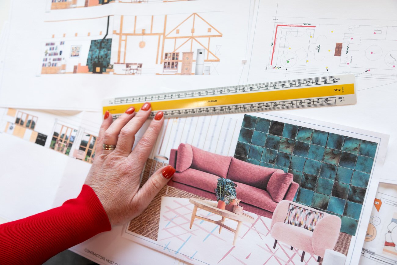
Here you can see one of our scale drawing elevations for the fireplace wall, a lighting plan and a product sheet with proposed colours and textures for furniture and finishes.
Get in touch
Request our online services and price guide.

