A professional welcome for this Barristers’ Chambers in Central London
Barristers’ Chambers | Reception and Boardroom Design | Central London
Classic Contemporary
A reception and waiting room say a lot to clients about what kind of a company they have stepped into. Working with this Barristers’ Chambers, the goal was to give their clientele the right message about the representation they were going to receive. The fresh classic contemporary interior evokes the firm’s rich history as well as showing they are forward thinking.

Classic Architecture
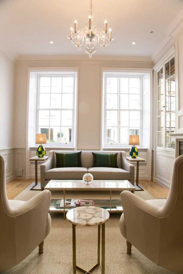
The aim of the project was to move their old reception, which had a waiting space, into what were two disused rooms on the opposite side of the corridor. The first room was to be a standalone reception area, the other a comfortable smart waiting room. The building is full of classic architectural features including a Grade Two listed original wood panelled wall, a fireplace and built in cupboards.
Accessories
The aim with the interior design was to work sympathetically with the building and create the best layout for the spaces, which helps the visitor flow easily through from being greeted at the reception desk to waiting for their appointment in the waiting room. To bring the rooms together, panelling was added in the reception and a soft neutral palette with green accessories to lift the scheme was used throughout.
Luxurious Upholstery
With modern wood flooring, custom designed reception desk, luxurious upholstered furniture and accents of brass these rooms reflect the attention to detail and quality of this Barristers’ Chambers.
Finishing Touch
To add the right finishing touch, the rooms and cupboards were styled combining articles that spoke about the story of the Chambers with modern pieces.
A contemporary and versatile boardroom
Following our redesign of the reception and waiting room for this Barristers’ Chambers shown above, our client asked us to give their boardroom a similar makeover. As before, they wanted a contemporary space that retained the heritage of their brand, but it also needed to be flexible, functional and set the right tone for their client meetings.
Although the room will function primarily as a conference room, from time to time it will also be used as a function room. This meant we had to get creative with the furniture and the all-important lighting scheme.
The room was an unusual shape with walls at irregular angles, odd recesses and arches that created nooks and blocked the windows. We began by removing unnecessary ‘lumps and bumps’ in the room to open up the space and allow light to flood in from the beautiful sash windows.
Because the focal point of a boardroom is the table in the middle, we added panelling to the walls to balance the room without making it feel cluttered. The paint colours for the panelling and walls were pulled through from the reception area creating a calming flow to the whole building.
We designed lighting circuits that allow for functional task lighting above the table, and mood-enhancing lighting on the curtains and art when the room is in entertaining mode.
A Sophisticated Décor
The colour palette for the room was informed by the chambers’ sophisticated brand colours: navy and warm grey with touches of yellow and red.
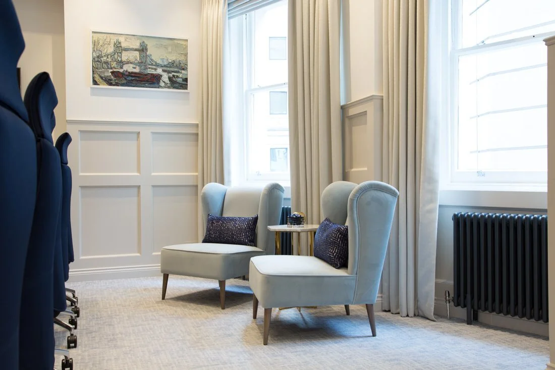
We went for navy boardroom chairs, blue-grey occasional chairs and neutral carpet and curtains to give an elegant and calming feel to the room.
We sourced new abstract art and reframed pieces from the chambers’ own collection to produce understated focal points without distracting from important business.


Clever Design Features
The room may feel serene but don’t be fooled: it’s as hardworking as the people who use it. The quiet décor conceals many clever features that make this room work beautifully.
First, the table. This large centrepiece is modular, which means it can be divided into pieces to create a smaller, more intimate table, or removed all together to create a function room. The table-top on each section folds into a vertical position, making it easy to store unused sections out of the way.
Our choice of flooring was a good-looking and deeply practical carpet tile. This provides easy access to electrical boxes in the floor for maintenance. Coffee spills are no big deal when you can replace a couple of tiles, and this floor also provides a comfortable and robust surface for the wheelie boardroom chairs.
For an extra touch of luxury, the three roman blinds can be lowered simultaneously at the touch of a button for presentation blackout.
Soft SEating
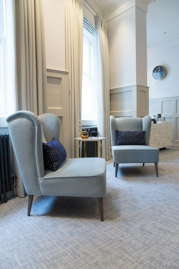
As well as creating an attractive feature that softens the tone of the room, these two informal seats are a popular place for a quick catch up meeting or a quiet phone call when the boardroom is not in use.
Styling
So often over-looked in a corporate space, styling adds the touches that make a client feel comfortable and at ease. Here we added elegant navy cushions to the soft seating which warms the space and makes it easier to relax. We also used a few carefully chosen accessories that add a contemporary, luxe feel.
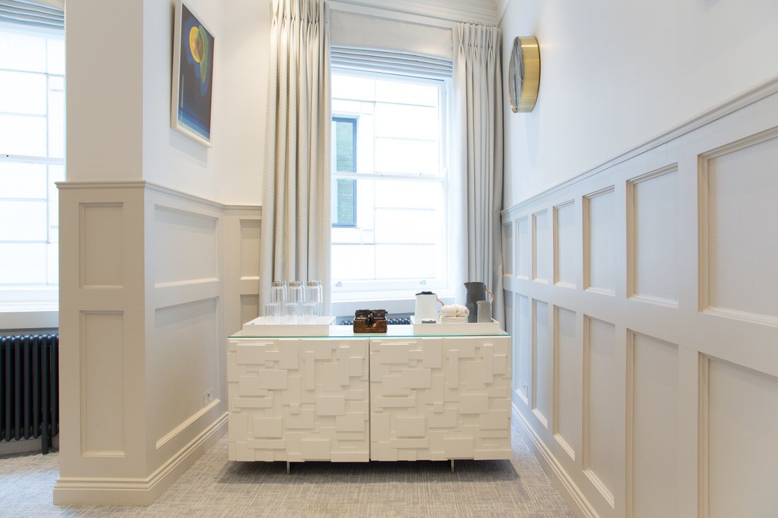
Trays on the boardroom table and the drinks cabinet group together useful objects like pen pots or glasses to avoid them being scattered in a haphazard way.
The final look feels sophisticated, considered and orderly: features that most clients would value highly in a barrister.
Get in touch
Request our online services and price guide.


