Colour and light dance around this uplifting family home
Contemporary Townhouse | New Build & Complete Interior | Tunbridge Wells, Kent
A real sense of joy radiates throughout this welcoming and comfortable townhouse. The owner knew she wanted her new-build home to be somewhere she and her family would feel happy and relaxed, and she embraced the project with a real sense of adventure.
As we got to know our client, we understood she needed this home to work not just for her own children (who have almost flown the nest) but also for the children of her partner when they visit.
The rooms needed to be flexible enough to serve multiple functions, with extra beds appearing as if by magic when required. Inspired by the colour and energy of 1960s Carnaby Street, she chose to steer clear of show-home neutrals, opting instead for a revitalizing hit of colour.
Light and Airy Kitchen
Light floods in through the bifold doors at the back of the house, so we decided to use white on the walls and ceiling to create a seamless sense of space in the open plan kitchen, dining and soft seating area.
White can sometimes feel a bit stark, but here there is plenty of colour and texture to add softness and prevent it feeling cold or clinical. Upholstered dining chairs in fuchsia pink velvet make for comfortable gatherings round the table, and we chose a mix of coordinating plain and graphic print for a casual feel.
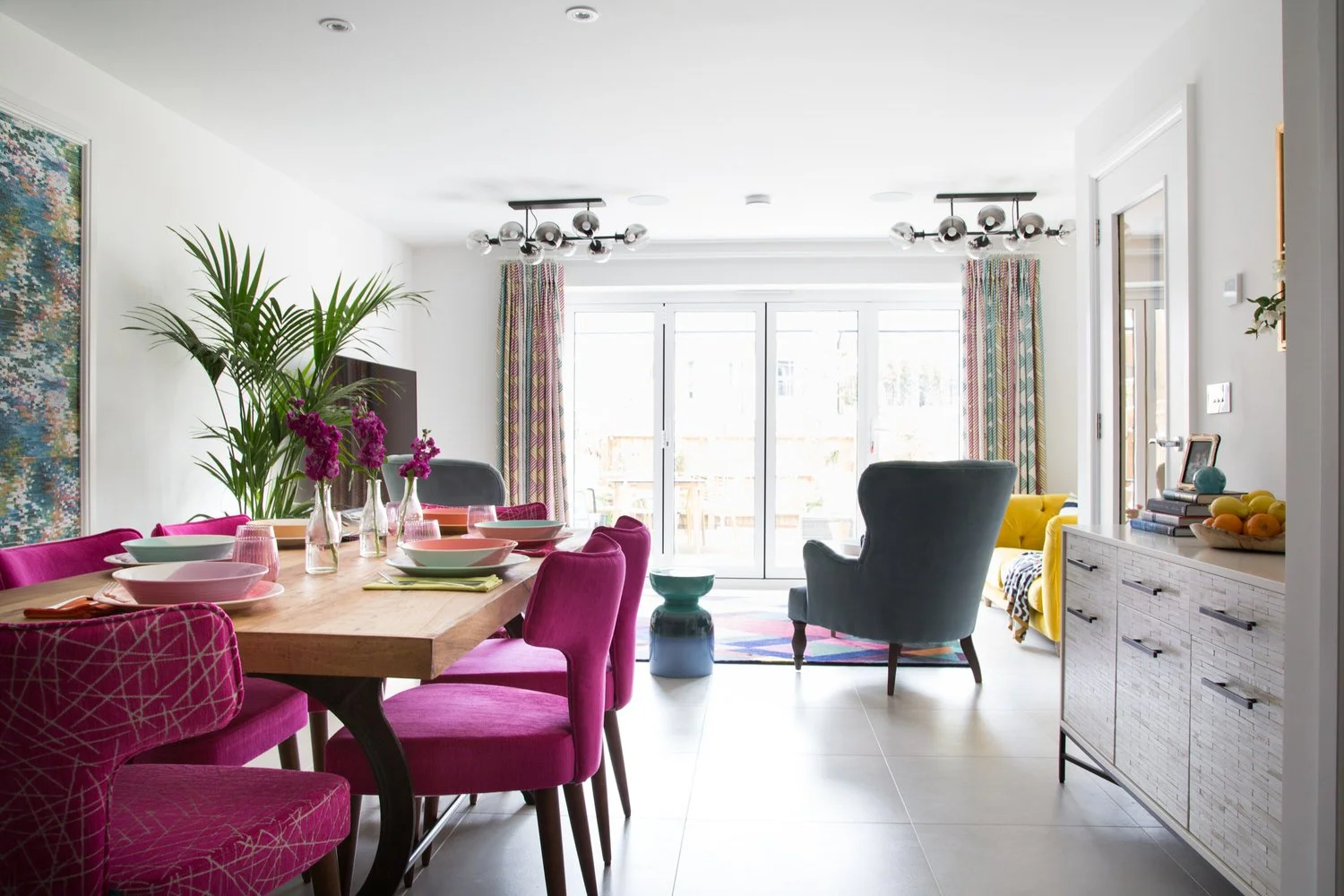
The large dresser is a great place for hiding everyday clutter, and its pale wood finish and delicate legs mean it offers ample storage without dominating the room.
“Phoebe manages to successfully combine creativeness and professionalism, so the result is a journey that ends up with having a house that truly reflects your own personality. She talks you through every phase, so you know what to expect and you know that she is acting in your best interest.”
Magnetic Attraction
Holistic interior design focusses on what matters most to you, so finding a way to display our client’s personal collection of magnets was the kind of challenge we relish. Our versatile solution was to create a large magnetic board in a frame, which we then papered with an abstract print.
With the collection in place it makes a fun display alongside the dining table. For more formal dining, our client can remove the magnets as shown below, for an instant elegant artwork.
A space to just be
A bold geometric rug grounds the seating area at the other end of the kitchen, and provides a delightful space to read a book, watch TV or enjoy a coffee with friends. A favourite artwork adds a cheerful touch.
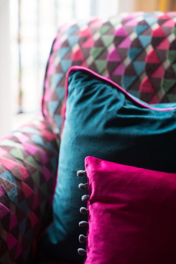
We’ve used a mixed palette of dark and light blues, pinks and yellows in this space and these same colours can be found throughout the house, drawing the different rooms together to create a sense of harmony.
Connecting the spaces
Moving through the house, the light changes, with the sitting room and bedrooms getting a lot less natural light than the kitchen. How we transition between these spaces is important, to avoid the house feeling disjointed.
Here, the bright hallway connects the kitchen and the teal coloured sitting room. The kitsch pop art wallpaper is perfect for a transition space and sets the tone for a deeper colour scheme in the sitting room. The sideboard is painted in a deep grey to make it recede, and the pops of magenta pink from the lamp and stool pull the space together.
The staircase is painted in a strong yellow and becomes the backdrop for a collection of favourite family photos and artwork. Here we have turned a potentially ordinary space into an uplifting personal gallery, which makes daily trips up or down the stairs just that little bit better.
A cosy and versatile sitting room
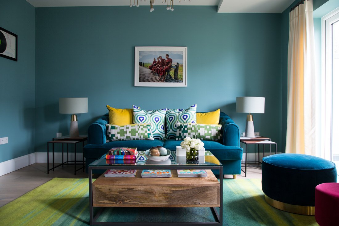
When a room has limited natural light, stronger colours can fight the gloom and create a cosier space. Tonal layers of teal are warm and restful in the sitting room: we used a different shade for the walls, the sofa and the bespoke cabinetry to avoid overwhelming the room.
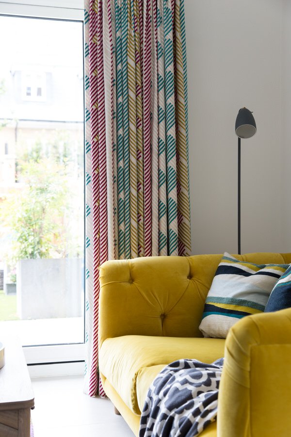
Yellow, citrus green and flashes of hot pink elevate the scheme from serious to sunny. Pale curtain fabric gives the illusion of width to the full height windows.
Because this room functions as a sitting room, a study and as an occasional bedroom, seating has to be flexible. The pouffes are perfect for kids and can be moved around as needed, and the sofa becomes a sofa bed.
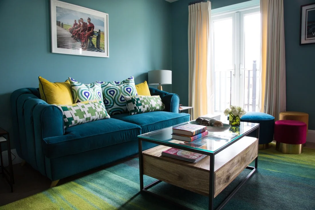

This hard-working room holds the lion’s share of storage in the house in the bespoke floor to ceiling cabinetry. It not only houses the TV and soundbar, but bookcases, box files and household paperwork which can be easily accessed from the desk. The push open design of the base cupboards means no handles are required, and we worked with our client to create the decorative panel design.
We put a great deal of thought into how to get the most from this room without it feeling over crowded. Ample storage, versatile furniture and creative layout mean this room meets all our client’s requirements but still feels calm and spacious.
“Working with Phoebe has been a journey of discovery resulting in a colourful, comfortable unique, slightly crazy, beautiful and comfortable house that really reflects me, but I know I would not have come anywhere close to achieving this without the help of the Smartstyle team. Thank you.”
A luxurious Master Bedroom
At the top of the house sits our client’s sanctuary; her bedroom, dressing room and bathroom. The bedroom has a sloping ceiling, or skeiling, which creates some unusual angles. Continuing with the teal theme, we’ve painted the walls, skirting, ceiling and skeiling in the same deep blue colour, blurring the lines and making the room feel larger.
The bed is upholstered in a muted lime colour which is more restful than acid green, but the button-backed chair in bright yellow adds the signature pop of colour. Bedside tables in dark teal recede making a small space seem wider, and the wall mounted bedside lamps free up surface area on top.
The deep blue jacquard curtains add opulence, and co-ordinate with the roman blind in the dressing room. Two box frames hang in the bedroom and display something truly precious: baby clothes belonging to our client’s daughter and son. We were fortunate that the colours worked beautifully with the scheme in this room. This is a striking way to create a bespoke piece of art that is more precious than any print, and is another example of how this owner has created a home that is a true expression of her life and personality.


The dream dressing room
This room is a continuation of the master suite, so we carried the blue walls and ceiling through, but added a pale pink sofa bed for a touch of playfulness.
The coffee table doubles as useful storage, holding the bedding for the sofa bed which can be whipped out at a moment’s notice for an overnight stay. The full length mirror is essential for a dressing room but also helps to bounce light around and make the space feel larger.
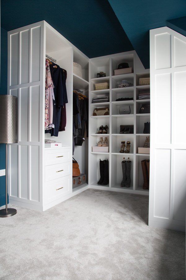
One of our favourite features in the whole house has to be this luxurious walk in wardrobe which we created in a tricky space using bespoke cabinetry. It has been designed with no doors to make access easier, and also to give the whole room an indulgent dressing room feel, rather than just another bedroom dominated by fitted cupboards. The cabinets were painted uplifting white and fitted with simple brass handles.
The Result
We worked closely with the client to make all her dreams a reality, and the results not only look great but work for the people who share this beautiful home. Most important of all, our client feels she finally has a home that reflects her personality and a place where she feels truly comfortable.
Get in touch
Request our online services and price guide.


