A family home full of character and colour
Oast House | Complete Renovation | Tenterden, Kent
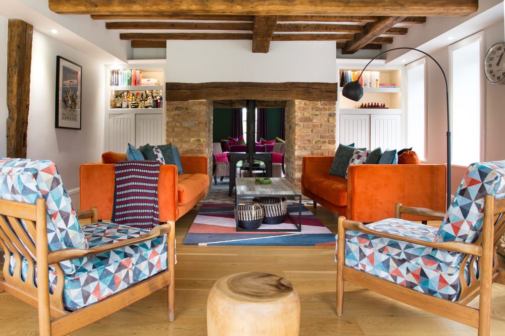
This converted oast house in Tenterden is packed full of interesting architectural features. It has exposed brickwork and beams throughout, statement fireplaces, and plenty of light from the large, metal windows.
The owners wanted to avoid making the house feel too quaint, instead deciding to work with the industrial feel to create a modern, welcoming family home.
They had already installed a new kitchen and had tried to inject some colour here and there, but the space wasn’t flowing how they needed it to, and the décor felt disjointed and unfinished, rather than cool and inviting. This is when the owners called Smartstyle for help.

Kitchen and Dining Area
The first job was to reassess how the space was being used in this large open plan area. By reorientating the dining table by 90 degrees, we were able to redesign the seating area by the fire to create a cosy snug.
Now the beams on the ceiling create a natural division between these two connected spaces that previously had conflicted with each other. We included plenty of built in storage either side of the fireplace for boardgames and baskets under the table for other transient clutter like newspapers and magazines.
Another benefit of relocating the dining area was that it gave us a clear ceiling to install this wonderful over-table lighting arrangement. The owners of this house are big fans of vintage and one-off items, so we sourced this collection of three vintage orange glass lights to create a feature over the table.
We added four high-street lights in clear glass to balance the colour and create a generous installation. We sourced vintage mid-century dining chairs and re-covered them in our clients’ chosen fabric.
At the other end of the room in the kitchen we continued the vintage theme by installing shelves made from scaffolding planks and industrial style brackets. The tongue-in-cheek illuminated artwork reads “we should hang something cool here” and is a robust piece that can hold its own in a kitchen environment.
This family love to entertain and now have a large, sociable and comfortable space to do it. Industrial style can be quite cold, so working with the existing charcoal grey kitchen, period features and oak floor, we used a modern colour palette of tempered orange and teal which adds oodles of personality and warmth to the room.
The large table, child-friendly bar stools and relaxed seating area create places to linger together in a space that feels united and uplifting.

Sitting and Television Room
In family homes where the kitchen is a multi-functional living and working space, sitting rooms are a place to relax and unwind in the evening when the children are in bed and the day’s work is done.
This gives us scope to be a bit more adventurous with the design, switching safe neutrals and light-flooded day rooms for something cosier and more indulgent.

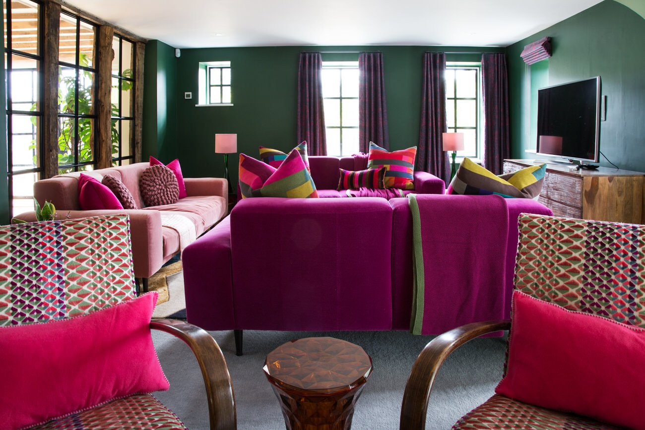
This is a family sitting room designed for watching TV and unwinding together. Although it’s a good size, with windows on three sides and a fireplace on the fourth, the layout needed some careful thought.
We divided the room into two main areas; the TV area with large sofas for comfortable lounging, and the seating area by the fireplace for curling up with a book or fireside chats. To make this layout work, we covered over a window behind the television.
This may seem dramatic, but staring into a TV that is backlit by a window can be really hard on the eyes, plus the window is still intact on the outside of the house. This one change has maximised the use of the space and as the room will mostly be used in the evening, little light has been sacrificed. At Christmas or family gatherings it is easy to pull one sofa back and include the two armchairs to create one large seating area.
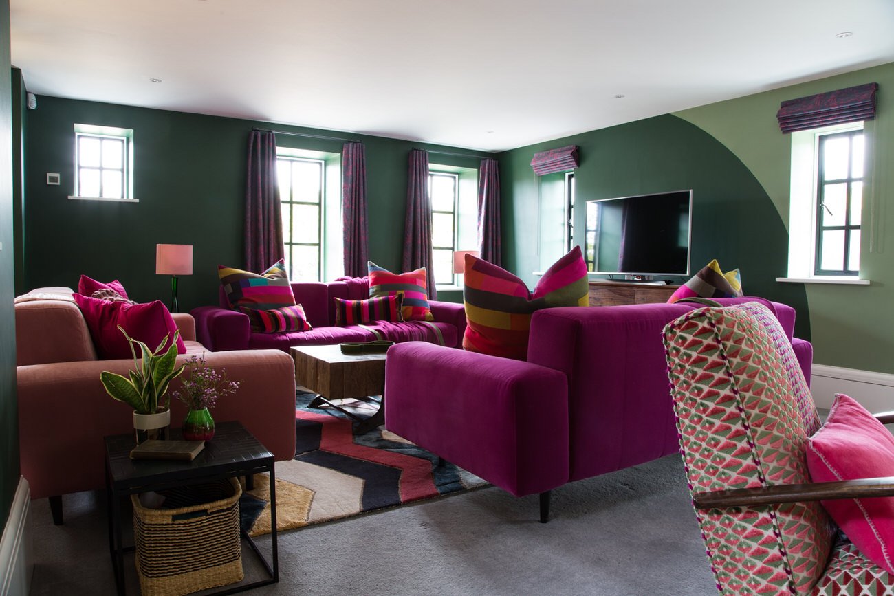
The two seating areas are subtly defined with two different wall colours; the lighter sage green and darker green meeting in a soft curve.
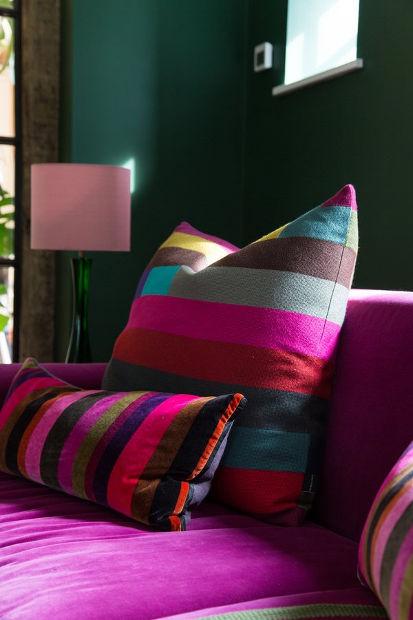
You can never have enough storage so as before we’ve added painted cupboards eitherside of the fireplace. Coloured vintage glass and a chunky industrial style coffee table continue the overall story of the house. Finally we added ample cushions and soft throws, making this room the perfect place to snuggle down with a box set.

Home Office
Like so many others, the owners have been working from home much more than they expected since Covid hit. Prior to creating this home office for two, they were perched around the house in awkward spaces that were a challenge to work in. Having this sophisticated space has revolutionised working from home.
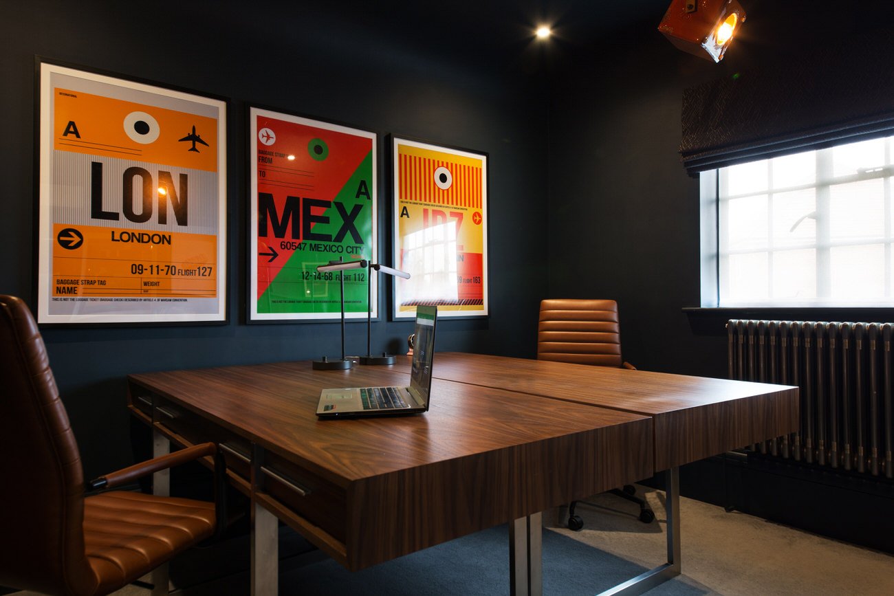
The centrepiece in this room is the two large, back-to-back executive desks. They provide more than enough space to spread out, and also contain useful storage to keep clutter out of sight. High-back leather chairs are ergonomically designed for comfort, but without the corporate look of many office chairs. The dark blue walls are lifted with hits of orange from the artwork, and the room is lit by two quirky pendant stage lights.
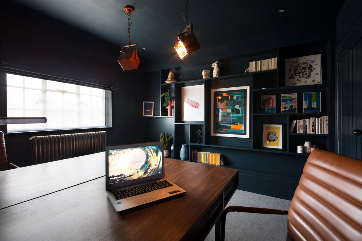
A feature wall of shallow shelves in irregular sizes displays art, books and interesting objects. This is a clever way to create a feeling of depth without giving away too much of the room.

Hallway
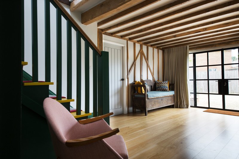
Often overlooked, the hallway is a great opportunity to make a big impact in a small space. Here we gave it the vintage treatment, with a beautiful mid-century chair re-covered in a soft pink fabric.
Although re-covering furniture is not always cheap, we choose vintage pieces carefully so they hold their value and even become collectors’ items.
There is a strong sense of colour running throughout the house, but in certain areas, like the hallway and loo, we chose more gentle tones to connect the spaces without creating overwhelm. However, we have pulled through the dark green and pink from the sittingroom into the statement stairs and runner, as the two spaces are connected by an internal window.
The antique bench seat was updated with a bespoke seat pad and cushions in a modern, graphic print, showing how old and new can be mixed to great effect.
Toilet
Master Bedroom
When you don’t have much space to play with in a bedroom, the bed automatically becomes the focal point. Here we embraced that totally with a one-of-a-kind bespoke upholstered headboard.
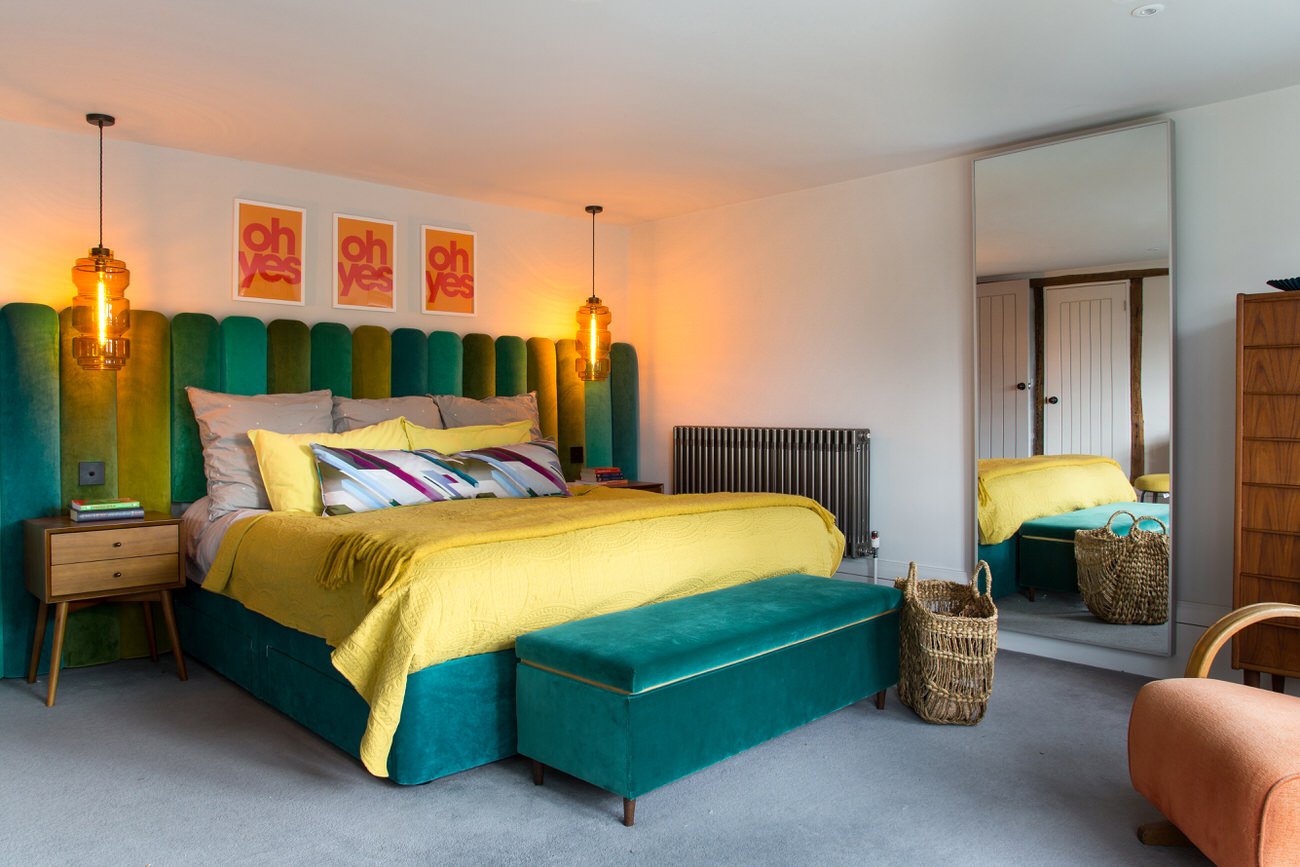

The headboard is generously proportioned to cover the full width of the wall and is higher than a standard headboard. It is upholstered in velvet in a range of teals and yellow-greens, and the divan and ottoman were covered to match.
The bedside lights are new but have a strong vintage look and suspending them from the ceiling maximises space on the bedside tables. The switches are neatly positioned in the headboard.
A row of graphic art prints above the bed adds another pop of colour and touch of cheek.
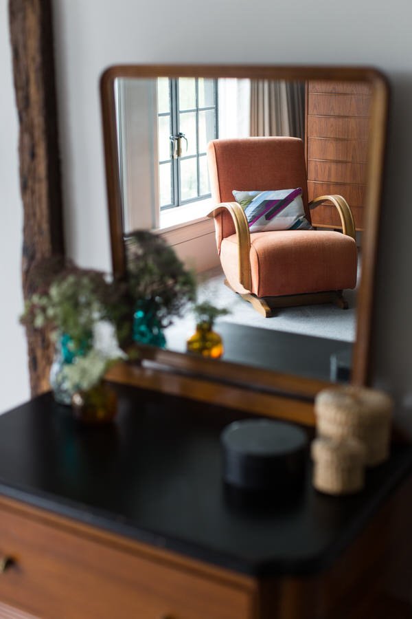
With such a statement bed, the rest of the room is kept relatively calm with a small dressing table and a handsome tall boy that provides plenty of storage.


Children’s Bedroom and Playroom
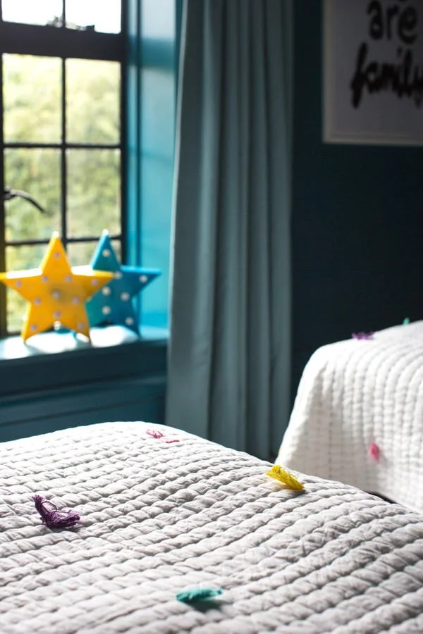
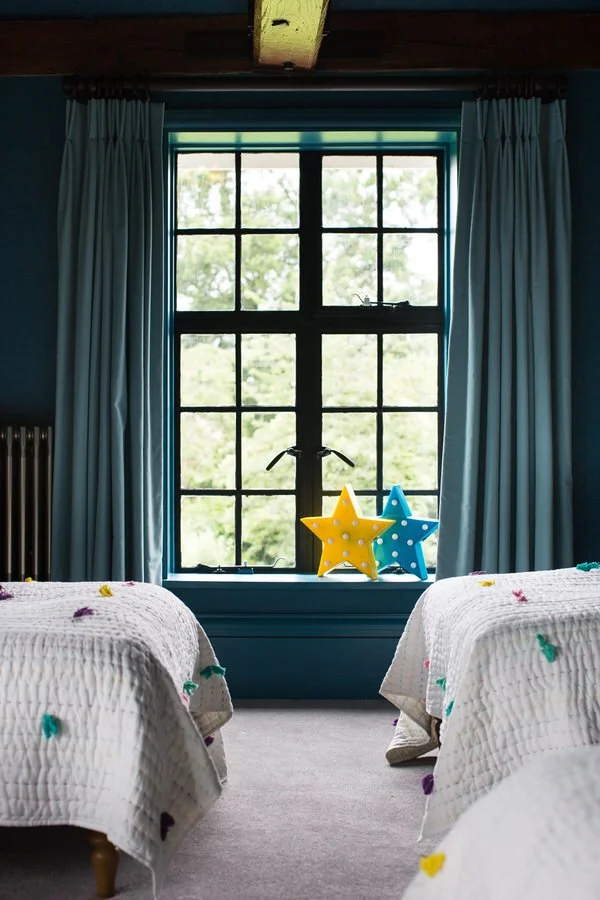
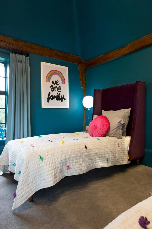
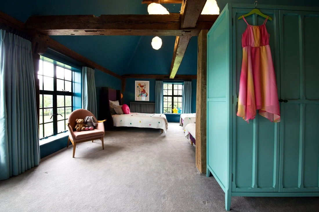
We used a colourful but calming colour scheme for this open-plan bedroom and playroom which is shared by three siblings. A warm blue combined with touches of sunshine yellow and turquoise are the backdrop for clouds, balloons and star motifs. It’s the perfect room for floating away in play or drifting happily off to sleep.
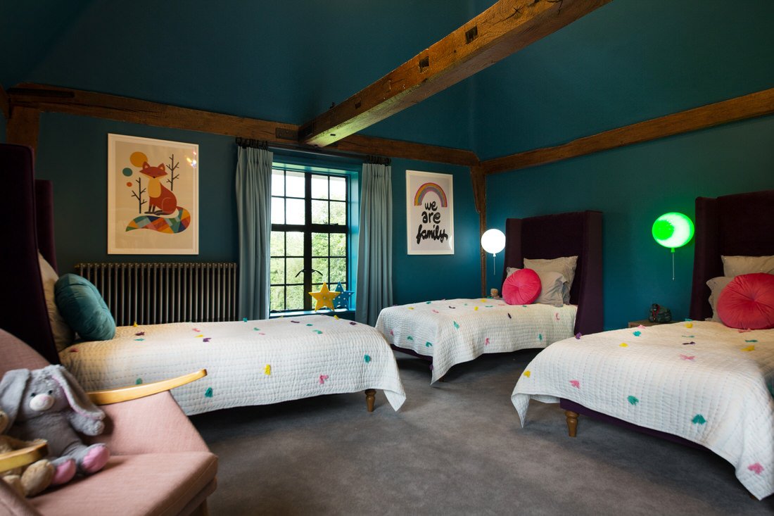
We had no shortage of space in this room, in fact, we looked for ways to make the room feel cosy, not cavernous. First of all, we created a half-height partition wall to separate the bedroom from the playroom and create two distinct areas.
By continuing the wall colour over the high, vaulted ceilings, we visually reduced the height while still retaining the beautiful architecture of the exposed beams. Cloud-shaped ceiling lights in the bedroom, and large coloured glass chandeliers in the playroom, fill the overhead space. Winged headboards and different coloured balloon lamps by each bed give each child a sense of personal space.
Get in touch
Request our online services and price guide.


