A whole house design for a new build
Architect New Build | Complete Interior Design | Pluckley, Kent
Our clients bought this new four bedroom detached family home off-plan, and originally brought us in while it was still being built to help make decisions about finishes for the kitchen and flooring.
The house is part of a striking new development of contemporary architecture which combines traditional brick and timber with large feature glazing. The choices we made inside the house needed to reflect this stylish, design-led feel, while still feeling like a welcoming family home. The owners were keen to embrace the warmth of strong colour, a Smartstyle signature look.
Creating impact in the sitting room
A large, bright pink sofa was a key piece that the owners brought with them, so this became the starting point for our colour scheme.
We were also working with the dark finish of the window frames, so we leant into a palette of deeper colours to ground the bright pink. Adding dark colours to pink makes it feel sharp and cool, and avoids it becoming too fluffy.
Although the glazing is a key feature in this room, it makes it a tricky space to layout because every wall has either a window or a door, so furniture can’t be arranged against the wall. Our solution was to bring everything into the centre of the room, and add a corner sofa unit and a custom rug to create a cosy island.
The space in the middle is quite large, so we filled it with a nest of three tables which can be stacked or separated for flexibility. Their white surface reflects light from the big window, avoiding a black hole effect in the centre of the room.
A unique floral side table and handmade throws add colour and personality to the room. In a lost corner, we added a valuable storage unit, and styled it with artwork, vases and a lamp to make a complete feature of an otherwise unused space.
Cohesive design in the kitchen
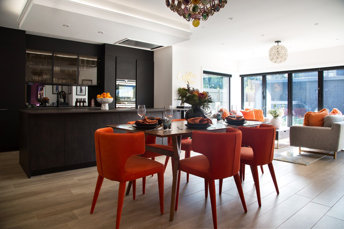
Colour plays a key role in making this open plan kitchen, dining and living space flow cohesively with the rest of the house.
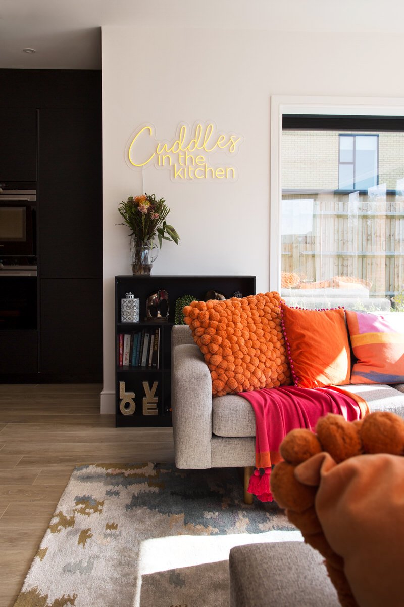
The full height dark wood of the kitchen units balances the dark wood of the chimney breast in the living room. From the double doors that connect the two rooms, the two features book-end each other. Although the feature colour in this room is a bright, juicy orange, touches of the bright pink of the sitting room appear in the soft furnishings and the pendant light.

This pendant light is a real statement piece in the room. Made with slices of polished gemstone, this sculptural piece looks great both when lit and not lit, and anchors the space above the table.
Our client used their existing dining table, and we added some beautiful chairs with a flowing shape. A fun feature of these chairs is the orange legs, and this has the added benefit of not adding a third wood to fight between table and floor.
In the living area we used a pair of existing sofas, and added a big hit of orange with generous cushions and throws in a mix of textures. A rug with subtle pinks and blues pulls through more of the colour palette from the sitting room.

A sanctuary in the master bedroom
The existing bed was a traditional brass bedstead, but we took this in a new direction with a dark and snuggly scheme in the master bedroom. The walls were painted in a very dark green, and extending this colour over the ceiling adds to the feeling of cosiness and creates a calmer, more cohesive space.
The bold leafy feature wall is a nod to biophilic design. It adds freshness to the scheme, and research shows that green has been found to lower cortisol and create a relaxing effect.
Glass pendant lamps either side of the bed are a real statement, and their marble finish creates a beautiful effect when illuminated. Pendants also have the added benefit of saving space on small bedside tables.
Touches of blush pink soften the overall look, and the reflective finish of furniture and metallics create contrast against the flatter, darker linen.
A child’s bedroom with growing room
Children can grow out of themes or hobbies that inspire a bedroom design in a matter of months. To avoid this, we gave our clients’ daughter a room that already felt grown up, but had plenty of fun touches to delight. For more costly investment items like curtains, we kept the colour neutral, so they wouldn’t need to be replaced in the foreseeable future (dinosaur/Barbie curtains, we’re looking at you!)
On the relatively small feature wall, we went a bit more adventurous, incorporating favourite colours in a stylish print. Our clients’ daughter is a big fan of Strictly, so we couldn’t resist sourcing these three oversized glitter balls which together make a great impact. The result is a room which feels fun and feminine without being childish.
Get in touch
Request our online services and price guide.


