Bringing colour, comfort and joy to a Victorian Terrace
Victorian Terrace | Complete Renovation | Brighton, East Sussex
Shortly after moving to this house, the unpredictable nature of life meant our clients had to put renovations and decorations on hold for a while. When the couple approached us for help, they were finally able to focus on creating the happy, comfortable home they had planned and were ready to start tackling the work.
The house had been divided into separate dwellings by its previous owners, so it had some strange room configurations and features, including dividing corridors and fire doors, which needed to be removed. A lack of suitable storage produced clutter, and the décor was dark and uninviting. Our goal was to create a cosy haven for our clients that would fulfil their functional needs and be a joyful place to live.
A warm welcome
We began in the entrance to the home, where a cheerful hit of yellow greets the owners the moment they step through the door. Next, the eye is drawn to the wonderful ornate mouldings in the entrance hall, the first of many original features in the house. By painting the ceiling and upper walls in a fresh white, we allow the natural light that floods in to pick out the contours and really do the mouldings justice. The white fish scale lampshade subtly echoes this play with light and shadow.
The dark blue colour below the dado rail is an elegant grounding for the white and yellow, as well as being very practical in a high traffic area. A neutral runner with a coordinating dark blue stripe is on order for the stairs.
An oversized mirror bounces light around and allows for a quick check before heading out the door. Finally, a quirky bird-on-a-perch light fitting adds character to the simple scheme.
A sitting room with room to sit
The first thing to sort out in this room was the furniture layout, as the existing arrangement meant that if our clients wanted to watch TV together, one of them had to sit on the floor. Comfort was a high priority, so we chose ‘his and hers’ sofas to suit the size and preferences of each person. Each sofa was covered in a different shade of emerald green, one in linen and one in velvet, to add texture and character.
By placing the sofas at 90 degrees to each other, we were able to have the fireplace on one remaining wall and the TV on the other, allowing each to be a focal point from either sofa. In the corner opposite the two sofas we added a comfy chair, to complete a sociable circuit of seating for entertaining.
We built custom cabinetry either side of the fireplace to provide plenty of elegant storage space for books and a vinyl record collection. Glass fronts soften the look of the shelves for a calmer feel, and reduce the need for dusting.
“Phoebe came into my house as a breath of fresh air and worked her magic over several months. Her use of colour and style transformed our somewhat neglected Edwardian terraced house into a much-loved joyful home.
She has great style and a such a talented way of mixing fabrics, patterns and colour. She listened to my concerns and patiently explained her design concepts to me. She made it a really fun project and I felt very included in the process. Phoebe sourced all furniture, wallpaper and fabrics which made my life so much easier and enabled me to enjoy the process of transforming our living space.”
Colour and Light
The room, with its big bay window, benefits from the special, sparkly light found near the coast. We worked with this to create a bright, colourful scheme that would be a pleasure to be in at any time of day or night, using a fresh white backdrop and sharp splashes of colour inspired by a cushion fabric that our clients loved. It includes crisp greens, vibrant teal and splashes of yellow, red and lime.
We used the strongest colours as subtle accents applying the 10% rule, adding small yellow side tables, and painting the back of the bookcase in red.
A colourful glass pendant light draws the colour up to complete the space and gives a sense of a central focus in the room.

Our favourite design details
There are so many small details in this room that might go unnoticed, but they all contribute to holistic interior design which looks great, works brilliantly and feels fantastic for our clients to live in.
We love working with existing client possessions and building a room scheme around them, so we were happy that their artworks and rug were able to inform our chosen colour scheme, creating a sense of harmony with the things they love.
In a square room with a square configuration, we have softened the sharp edges with rounded furniture designs and plenty of squishy cushions. Coloured throws add a cheerful splash of colour and cosiness when curled up with a book or watching TV.
The nest of two round coffee tables is versatile and accessible. One can be used for styling flowers or favourite objects, and the other can be pulled out for use – making this table both beautiful and practical. The white marble tops bounce the light around and there are no sharp corners for shins when moving around the room!
The overall result is a sitting room that feels uplifting, comfortable and most importantly, like home.
A stylish Master bedroom
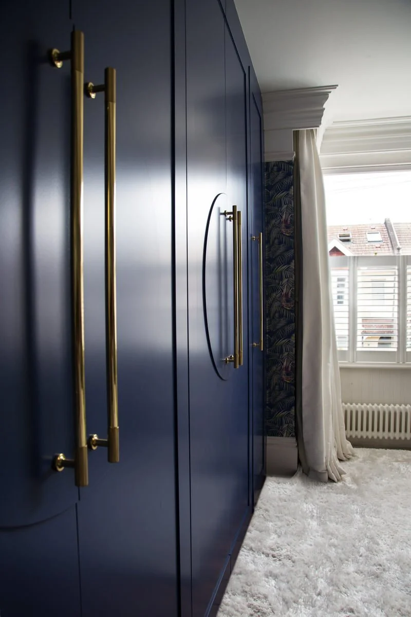
One of the legacies from when the house was divided into separate lodgings was a strange configuration in this bedroom, which included a dividing wall and two entrance doors. We removed the wall along with a walk-in wardrobe which opened the room back up to its original generous proportions. By adding ceiling-height fitted wardrobes along one wall we were able to increase not only the floor space but also the storage space – a win/win by any standard!
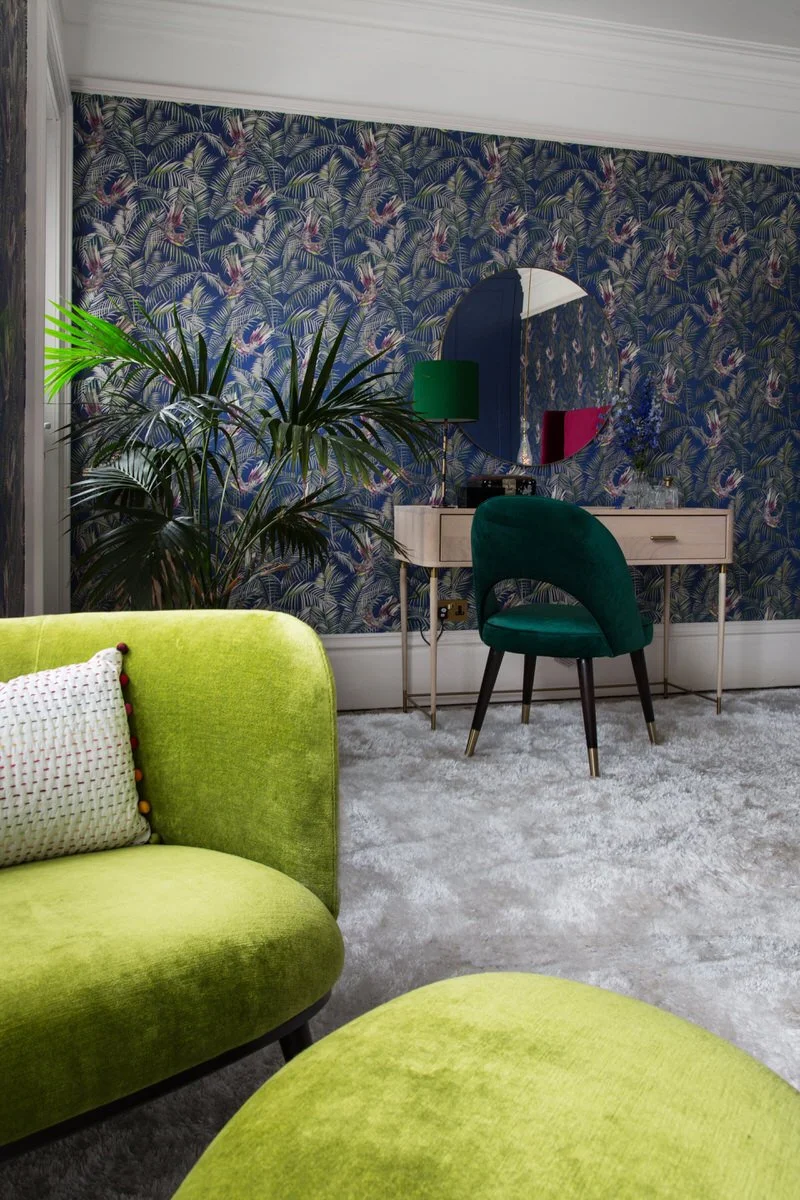
The room has a rich, luxurious colour scheme inspired by the glamorous wallpaper. The blue on the wardrobes continues the blue background of the paper, and the citrus green of the flowers and deep pink of the bird are used as accent colours in the plush velvet chair, foot stool and headboard, which were all made to order.
These investment pieces were made possible by a smart use of the budget: the bedside tables and matching dressing table are great-looking high street heroes bought for a very sensible price.
Warm brass was our metal of choice for this scheme, and features on the furniture, light fittings and wardrobe handles, pulling the room together. The cut glass bedside lights hang like jewellery to add real opulence, and cleverly save space on the bedside table.
When designing custom wardrobes it is really important to consider the flow of the room and the potential friction points. Here we created two easily accessible double wardrobes in the centre of the run for the most regularly used items, and a single door each end for more occasional use.
With streetlights outside the window, we went to extra lengths to make sure the room was dark enough for a really good night’s sleep. Our solution was to move the coving to act like a solid pelmet to the blackout curtains, to make sure there was no light bleed around the edges.
Our clients were thrilled with the final result – a luxurious bedroom that is a pleasure to relax in whenever the opportunity arises.
“This was my first time working with an interior designer and it has been such a positive uplifting experience. I would thoroughly recommend Phoebe’s design services, her suggestions and advice meant we didn’t make expensive mistakes and have given us a beautiful, tranquil, grownup, stylish home.”
Get in touch
Request our online services and price guide.


