New kitchen, more colour
New Build Family Home | Complete Renovation | Tunbridge Wells, Kent
We first worked with this client a few years ago when they moved into this new build family home in Tunbridge Wells. Having got to know the house, and how they use it, they were now ready to replace the kitchen and go bolder with colour to add more interest and personality.
Before
After
A brighter, more spacious kitchen diner
This remarkable design proves that a new kitchen doesn’t always require an extension. In fact, we reduced the footprint of the house to create this bright, modern space by removing the classic conservatory that sat between the kitchen and the garden, blocking light and access.
We widened the access to the garden by removing a pier in the back wall to create generous bifold doors. Suddenly, light and colour from the garden could flood into the kitchen, completely changing the mood of the room.
We created more space in the dining area by rotating the table 90 degrees, and added small side piers to create a subtle definition between the kitchen and dining areas.

The new kitchen was created with a mixture of bespoke and off the peg elements by Jones Britain. On one side of the room a run of tall units to the ceiling gives a clean, streamlined look and provides ample space to hide away a larder unit, built in bar and appliances.
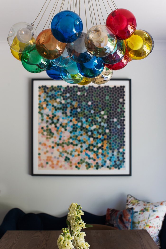
The colour scheme of dark blue and orange proves that strong colour can still be calming when lifted with hits of fresh white. The multi-coloured light fitting over the table adds a playful touch.
A hard-working centrepiece
An island is the central feature in the kitchen and functions as a work and social space. The rounded corners are echoed in the bulkhead above which neatly houses the extractor and gives a central core to the kitchen. Having the hob in the island allows the hard-at-work cook to face the room and enjoy a conversation.


Smart Storage
There is ample storage in the island, but that storage has been designed to work really hard. It’s easy to lose things at the back of cupboards, so large drawers were designed to fit what the client owns in an organised way. Everything has a home in this kitchen – the tangled utensils draw is a thing of the past!
It’s all in the detail
The custom floating shelves have curved corners so that the window doesn’t feel boxed in, and they echo the curves of the island.
One of our clients’ favourite details is the built-in bar, with mirrored back and integral lighting, making the kitchen a perfect place to relax with friends. Come Friday night, the ambient pendant lights set the mood for a well-earned drink on the bar stools.

One way to get a designer finish at a more reasonable price is to use bespoke details in moderation. This beautiful reeding on cabinet doors was only used in specific areas around the kitchen where the light would play on it for maximum effect.
“What we love most about the house now is how brilliantly it flows, and how welcoming it feels. We can enjoy it as a whole family, and with two teenage boys, it’s a really fun place for us all to hang out together.”
Sitting Room Refresh
Our client had become bored with the neutral scheme in the sitting room but wasn’t looking to replace the big ticket items. Working with existing sofas, lighting, blinds and occasional furniture we have totally transformed the mood of the sitting room.
Before
After
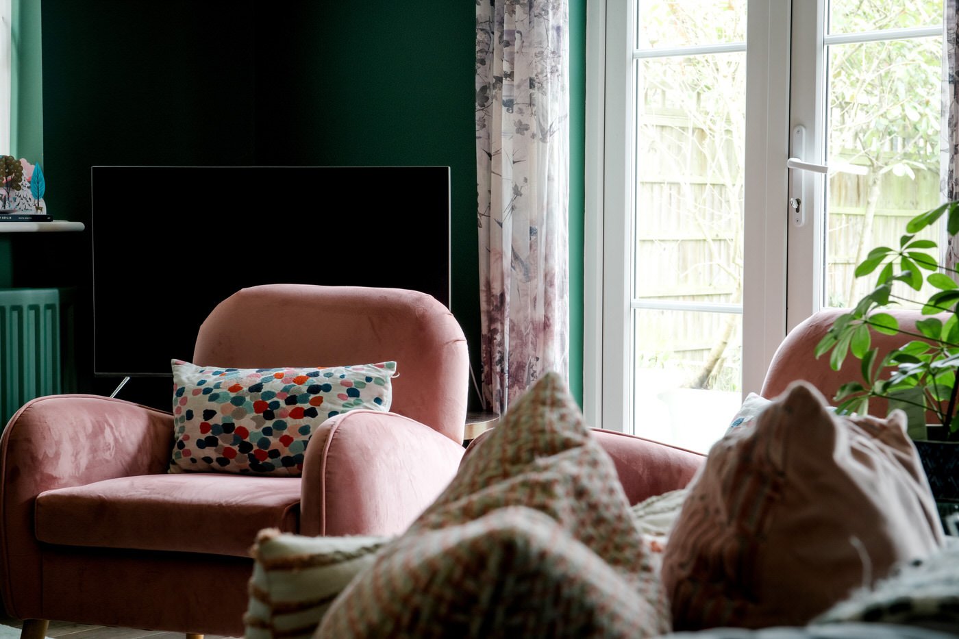
The most dramatic change in this room simply comes from the wall colour. The pale grey has been replaced by a rich dark green which instantly brings a cosier, more relaxed tone to the space. In this context, the existing sofas become highlights rather than fading into the background.
The next key change was to replace the small rug with a much larger pink and blue confetti rug which helped to expand the space. The colour palette was inspired by accents in a new artwork which is now hanging over the fireplace.
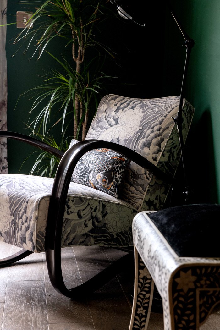
We added two small pink armchairs and recovered an existing vintage Halabala chair which can be used to provide additional seating for larger gatherings.
The glass coffee table was replaced with one that makes a more confident and grounded anchor point in the room. It was created using two smaller tables, making the perfect size piece for the space.
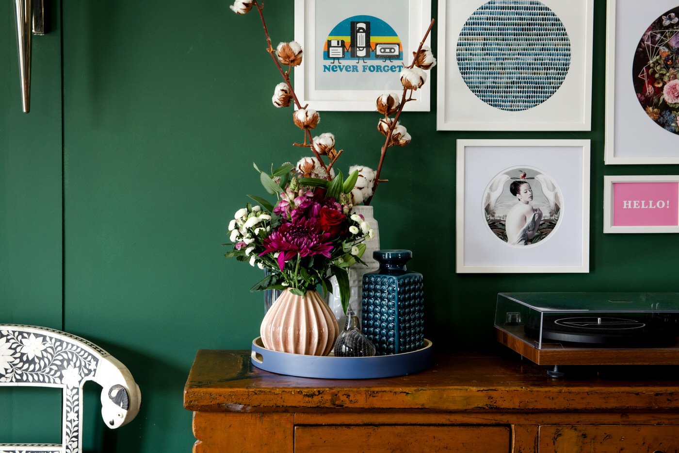
The final touch was to add some faux panelling to the large wall, which becomes a canvas for a collection of smaller artwork in white frames.
Design that grows with you

As time goes on, children grow, and we gave the above bedroom a stylish overhaul as the family’s eldest son entered his tweenage years. This bold bedroom design will grow with him over the years and thoughtful storage solutions ensure that it will be just as functional and comfortable to live in at seventeen as it is now.


Comfortable Oasis
This home isn’t only comfortable for the family that lives in it, but also for their guests! We designed a comfortable oasis complete with a plush sofa and private en suite so guests can make themselves at home when they come to visit.
“What we love most about the house now is how brilliantly it flows, and how welcoming it feels. We can enjoy it as a whole family, and with two teenage boys, it’s a really fun place for us all to hang out together.”
Get in touch
Request our online services and price guide.


